General information about viewing data
In PolyAnalyst datasets are presented in the form of a table which is generally referred to as the data grid.
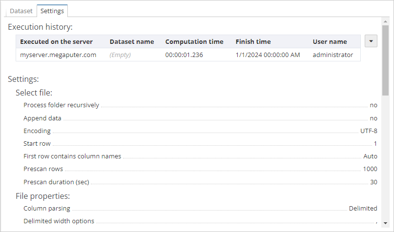
The report of a node that outputs a dataset usually includes two tabs, i.e. Dataset and Settings.
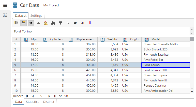
The Dataset tab
The Dataset tab includes the following sections:
-
Data – displays the data table;
-
Statistics – provides the basic statistical information about the data;
-
Distinct – displays a list of unique values for each column and provides the information on their frequency.
The Data section
The interface of the Data section is divided into the following areas:
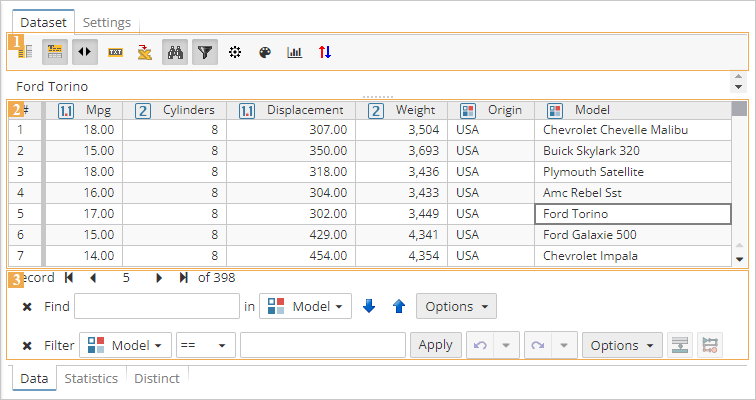
1) Toolbar – use the toobar to show or hide auxiliary panels, customize the table, export the data, etc. The range of available options may vary depending on the node type. Hover the mouse cursor over the keys to see the key assignments.
-
 Toggle columns panel – shows the columns panel to the left (hidden by default);
 -
 Toggle text panel – hides the text panel above the dataset (shown by default). See here for more information;
 -
 Toggle navigation panel – hides the navigation panel below the dataset (shown by default). See here for more information;
 -
 Use initial formatting – displays the original formatting of the text. If the option is enabled, for example, the text pane will display all the whitespaces and paragraphs of the source text;
 -
 Use initial source content - displays the original HTML formatting of the text;
 -
 Export - allows exporting data into a CSV or HTML file. See here for more information;
 -
 Toggle search bar - shows the search bar above the navigation panel. See here for more information;
 -
 Toggle filter bar - shows the filter bar above the navigation panel:
-
 Conditional formatting - allows users to customize element colors, create and manage conditional formatting rules;
 -
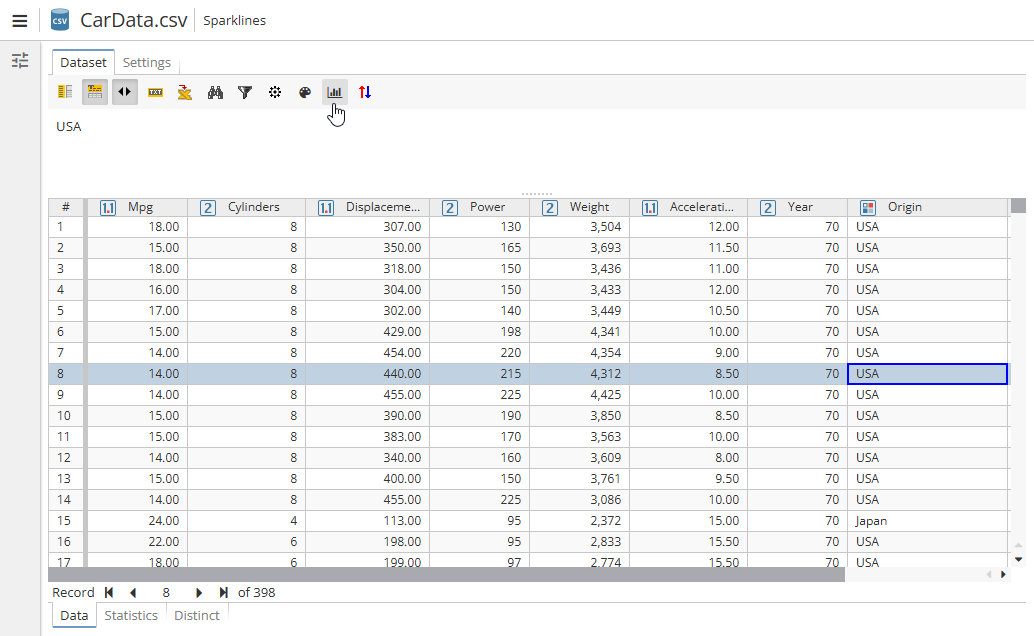 Sparkline - creates a miniature chart that will be placed in one cell. See here for more information;
 -
 Multi-sort - allows sorting of specified columns. See here for more information.
The output dataset of some nodes may additionally contain the following elements:
-
 Legend - shows a legend of the data if present (e.g. for Generic Dataset node used after some text analysis ones)
 -
 Toggle context panel - shows the context panel, which will open to the right;
 -
The
 Previous highlighted and
  Next highlighted buttons can be used to navigate across the highlighted elements within the selected record.
2) Data table – an interactive table that can be customized from the context menu. 3) Auxiliary panels – navigate the table, search for particular records, filter the data, etc.
Customizing the appearance of table values
In the data grid you can modify the appearance of values so they look different from the actual values.
Any changes introduced to the appearance of cell values are valid only for the current data grid and are not transferred to subsequent nodes. For example, a child chart node will operate with the value of 0.20 as it accesses the raw data, not the formatted (20%).
To merge cells with identical values in adjacent rows:
-
Enable the toolbar for the data table by selecting Show toolbar in the context menu.
-
On the toolbar, click
 .
. -
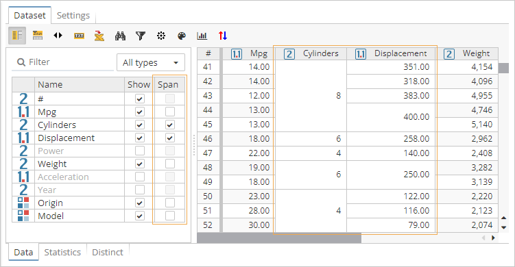
On the column panel, use checkboxes in the Span section to specify columns that will include merged cells:
Viewing the full contents of a cell
Values displayed in the data grid may be truncated, especially when the dataset contains large texts.
To access the full contents of a cell:
-
Enable the text pane by clicking
 on the toolbar or selecting Show text panel in the context menu.
 -
Select a cell in the data grid.
-
The contents of the selected cell will be displayed in the special area above the table.
The text pane loads data from the server independently. The data grid loads only truncated values so that it can scale in order to display a large amount of data. Therefore, when PolyAnalyst loads the contents of a text pane, it has to separately retrieve the full value from the PolyAnalyst Server. In case of large text documents, it make take some time to update the contents of the text pane.
For more information on the text pane, see the separate section.
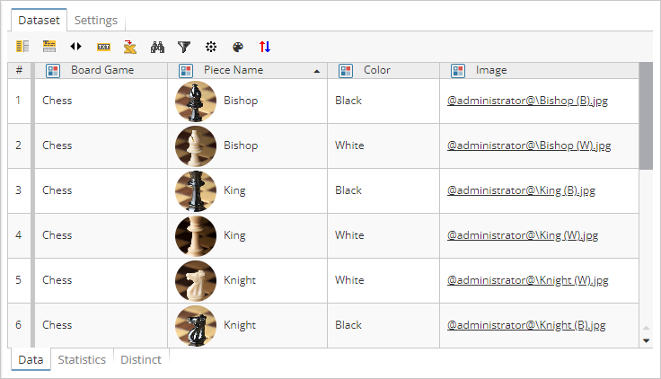
Thumbnails
In the data grid you can display thumbnails within table cells. To do this, you need to include either a column with the corresponding binary data or a column that contains links to images you want to display to the dataset.
To display thumbnails in a table column:
-
Right-click the header of the column you want to customize.
-
In the context menu, select Set thumbnail….
-
In the dialog that appears, specify a column that contains either binary data or links to source images.
-
Click OK to update cells of the corresponding column:
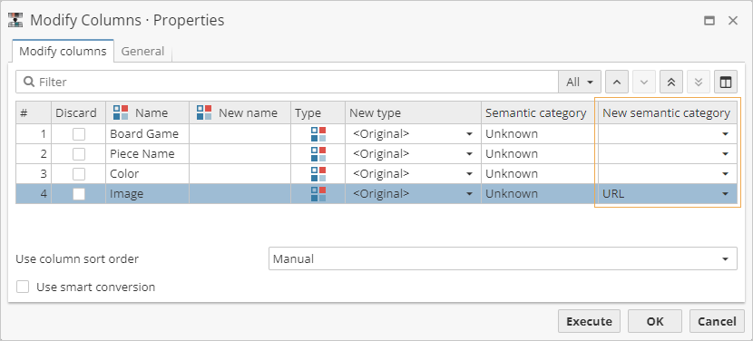
| If you decide to use links as a source of thumbnails, make sure the corresponding column is assigned the proper semantic category – URL. This can be done by means of a Modify Columns node: |
To disable thumbnails for a table column:
-
Right-click the header of the column you want to configure.
-
In the context menu, select Remove thumbnail.