Creating sparklines
Sparklines are small, compact charts that are placed inside a dataset cell.
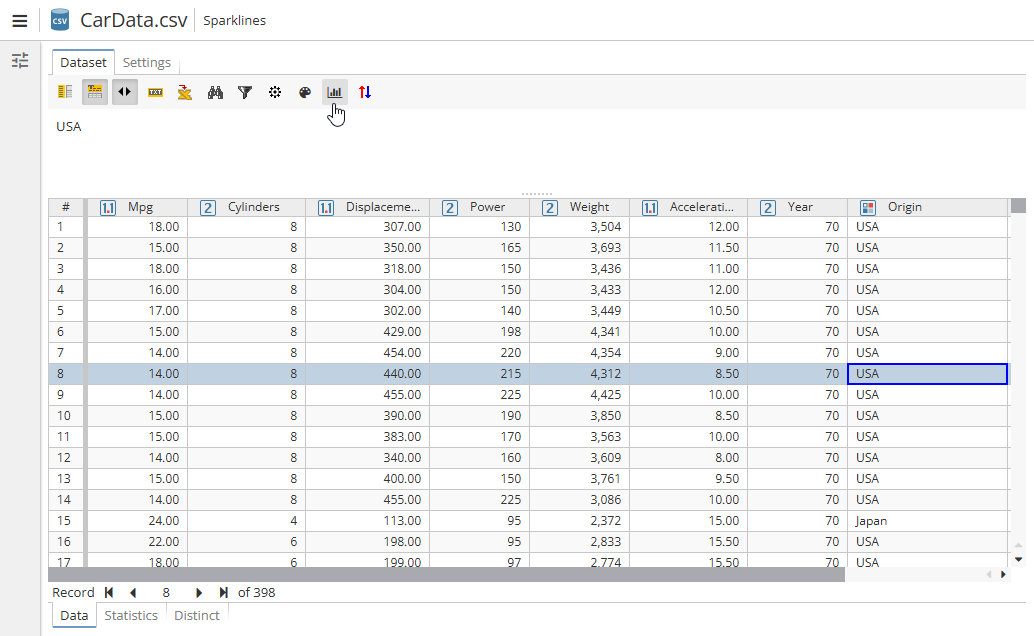
Click the appropriate button on the toolbar to open a tab with various options for configuring and visualizing charts based on data viewed in the PolyAnalyst node:
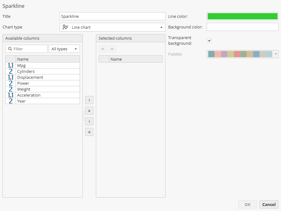
A new window will open:
There are different types of charts to choose the from the drop-down menu:
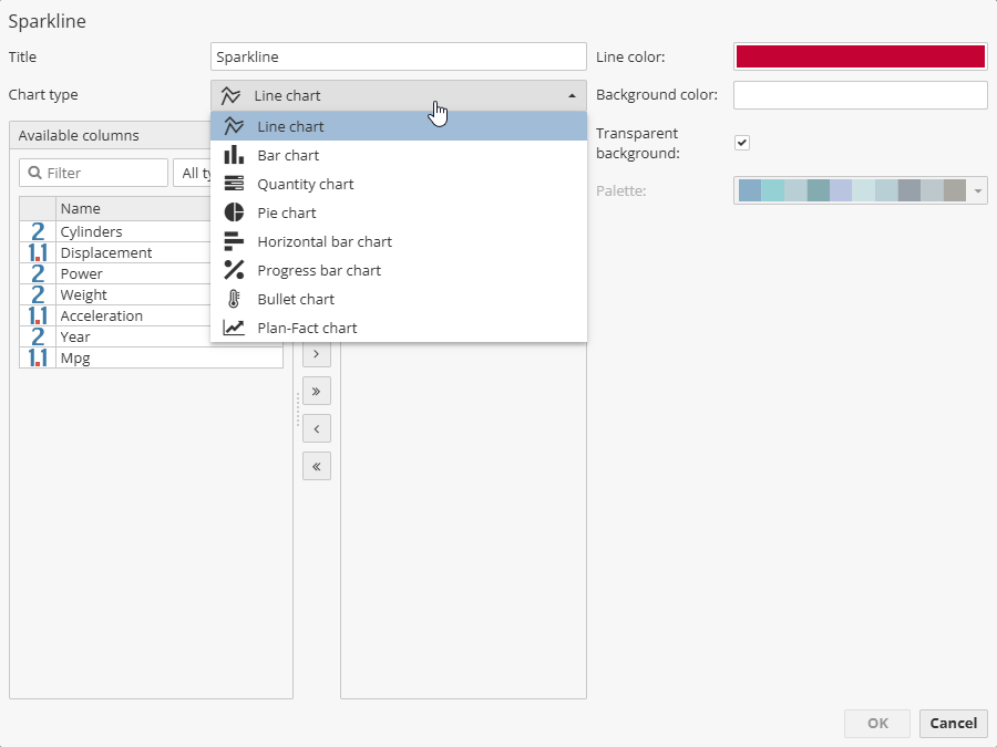
Let’s describe each type in detail:
-
Title – specify the name of the column with sparklines.
-
Chart type – allows you to select one of the following chart types:
-
Line chart – shows information in the form of lines connecting data points.
-
Bar chart – displays data in the form of vertical bars.
-
Quantity chart – used to display quantitative data.
-
Pie chart – shows data in the form of a circle divided into sectors.
-
Horizontal bar chart – displays data in the form of horizontal bars.
-
Progress bar chart – visualizes the progress of execution in the form of a graph.
-
Bullet chart – visualizes the progress of execution in the form of a bullet chart.
-
Plan-fact chart – visualizes the difference between planned and fact values, e.g. between sales plan number and actual ones.
-
The Available columns list on the left contains all the available columns from the input dataset. Users can filter the available columns list using the Filter text field above the list to find a column quickly. Move the available columns to the Selected columns list to build the chosen type of sparkline. Moving columns from one list to the other can be accomplished in multiple ways. Generally, you can use the appropriate buttons to move columns back and forth.
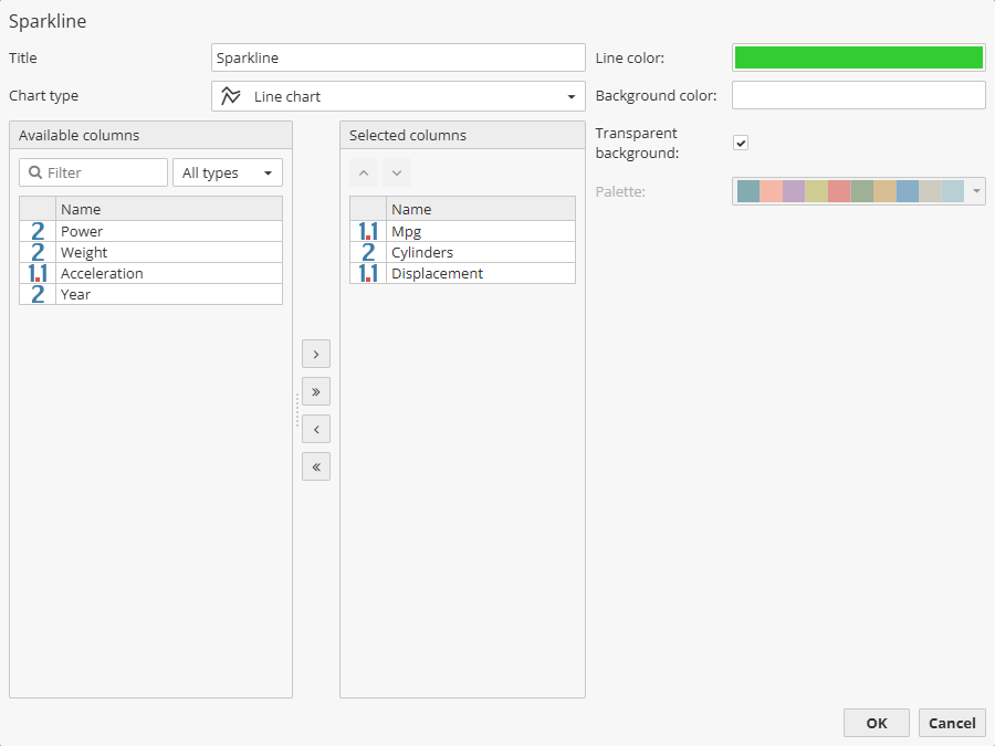
Chart configuration options depend on the selected type. The following options are common to most chart types:
-
Line colour – select the line color of the sparkline.
-
Background color – select the background color for the sparcline.
-
Transparent background – check the option to set a transparent background for the sparkline.
-
Palette – select a preset color palette for the chart. The palette is used to automatically assign colors to lines, columns or sectors of the chart based on the selected data columns.
The window settings depend on the chosen chart. Thus, for example for the Progress bar chart such a window will look as follows:
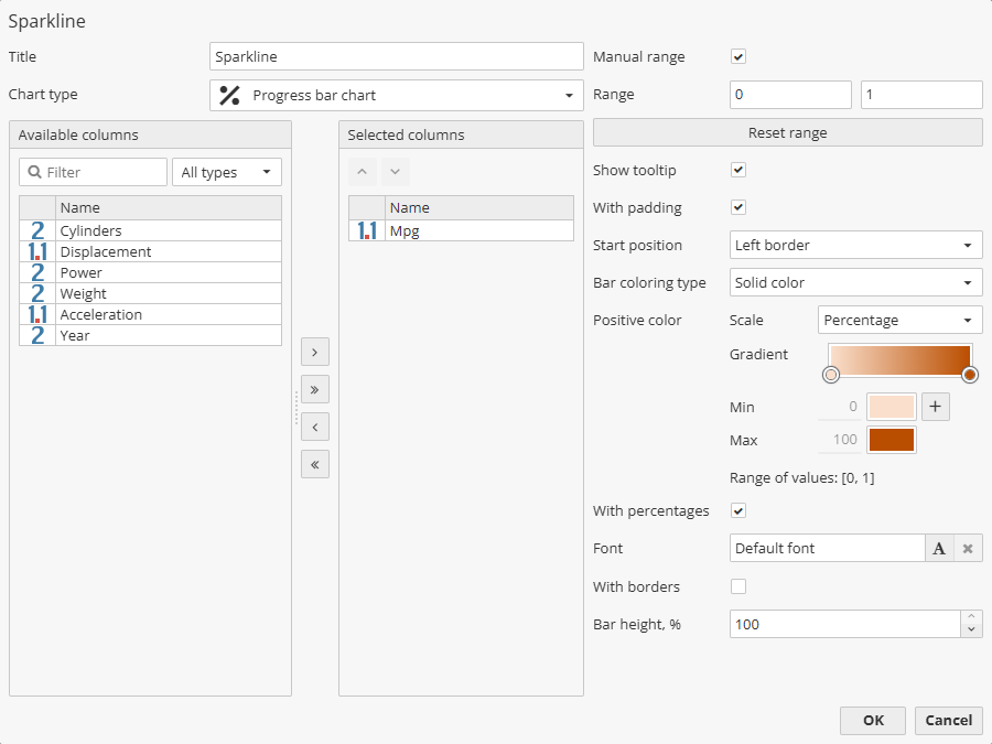
The following options are available:
-
Manual range – use the option to manually set values for the chart range.
-
Show tooltip – enable this option to display tooltips when hovering over chart elements.
-
With padding – check the option to place the chart at a distance from the cell borders in which it is located.
-
Start position – choose from the drop-down menu where the chart will start relative to the cell: Left border, Right border or Center.
-
Bar coloring type – select from the drop-down menu the bar coloring type: Solid color, Gradient, Stretch gradient.
-
Positive color – set the color used to display positive data trends.
-
With percentage – check the checkbox to display percentage values
-
Font – allows to set the font of the chart percentage headers.
-
With borders – check the option to draw the bar borders.
-
Bar height, % – use the field to set a custom bar height.