Customizing the flowchart
The flowchart is customizable. For example, you can change the grid style, arrange the layout of nodes, customize colors, etc.
Some of these options are available in the context menu by right-clicking the flowchart:
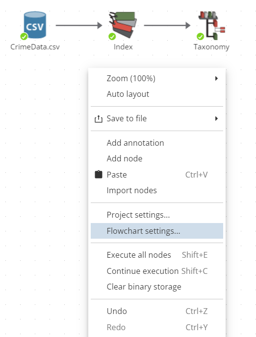
To access advanced settings, select Flowchart settings… in the context menu:
-
Default drag action – specify whether to select an area or move the canvas in the corresponding direction on drag.
-
Default drag action by right mouse button - specify whether to select an area or move the canvas in the corresponding direction on drag.
-
Show onchart progress – if checked, the execution progress will be displayed over the node.
-
Show closing dialog - if checked, a warning will be shown before closing the flowchart page.
-
Design mode – the Basic and Advanced modes are available, which allows switching to the advanced flowchart mode.
-
Force clear node state – specify the group of dependent (downstream) nodes that will lose their results when the parent node is modified.
-
Double-click behavior – specify the desired behavior when the user double-clicks a node:
-
View – displays the node results, if available, otherwise does nothing.
-
Edit – displays the node properties dialog.
-
Execute – initiates the execution of the node provided the node is configured properly, otherwise does nothing.
-
Conditional – in this mode the behavior depends on the current state of the node. If the node is not configured or configured incorrectly, double-clicking the node opens the node properties dialog. If the node is configured properly and is ready for execution, double-clicking initiates the node execution. If the node is already executed, double-clicking the node displays its results.
-
-
Hide Quick Access toolbar - if this option is enabled, the quick access panel to the basic and most frequently used commands when working with nodes will not be displayed when dragging a link over a node.
-
Select buttons for Quick Access toolbar - select a maximum of three commands from the list to be displayed on the quick access panel (users can drag and drop commands between themselves, sorting them in a convenient order):
-
View opens the View window of the node.
-
Add node adds a new node to the selected node.
-
Execute starts the node execution process. Note that during node execution, the Try to stop button will appear on the Quick Access toolbar. If you press this button, the node execution will be stopped. This stop affects only the current node and does not impact the execution of other nodes in the chain.
-
Execute to here starts the node execution process up to the selected node, including the selected node itself.
-
Add to report allows users to include the node’s result in the report.
-
Copy copies the node to the clipboard.
-
Properties opens the properties window of the selected node.
-
Delete node deletes the selected node(s).
-
-
Double click to rename node - if the option is enabled, renaming of a node by double-click is available. Note that you must pause between clicks.
-
Auto connect nodes – if checked, when adding a new node from the node palette (by double-click, drag and drop or from the context menu by selecting Add), it will be automatically connected to the currently selected node. This occurs only if the connection between th nodes is possible (the output of the preceding node can be used as an input of the subsequent node).
-
Connect node as - defines the order in which a node is connected to its two parent nodes (e.g., joining two nodes using the Join node):
-
Default - in this mode, roles are defined at the moment you connect datasets in the script. When the first connection is created, PolyAnalyst will prompt you to specify the role of the dataset. The second connection will be made without extra prompts.
-
Left Dataset - this mode will automatically assign the first connection the role of the table on the left and the second connection the role of the table on the right.
-
Right Dataset - this mode will automatically assign the first connection the role of the table on the right and the second connection the role of the table on the left.
-
-
Show system nodes - enable the option to have system nodes displayed on the script.
-
Background color – set the background color of the flowchart canvas. It is highly recommended to use a lighter color for the background. You should definitely use a color that will contrast with node icons, node names, and the color of the grid (if toggled on). To set the color, click the color box and select a color on the color palette.
-
Arrow color – set the color for links (and their arrows) between nodes. This is typically a darker color. The connections between nodes should be clearly visible so you can always distinguish the flow of information in your project and how your nodes are connected.
-
Focused arrow color – set the highlight color for links that are selected.
-
Arrow width – set the boldness of links, i.e. the area they take up. Each unit of width is roughly 1 pixel of screen space. Some users may wish to decrease this value to around 1. It is common to use the arrow width of 2 or 3. Larger widths may look blurry or overly bold. This is a purely an aesthetic option.
-
Curved arrows – if checked, links are displays as curved lines. Otherwise, straight lines are used.
-
Arrow style - select a connection style: Fill or Stroke.
-
Node name font – set the font style for the node labels. It is recommended to use a font size between 8 and 14.
-
Node name color – set the text color of the node name. It is recommended to use a color that contrasts with the background color of the flowchart.
-
Show focus frame – if checked, focus frame is displayed over selected nodes.
-
Focused frame color – set the color of the frame that highlights selected nodes.
-
Show node status – if checked, a status indicator is displayed in the lower left corner of every node on the flowchart. Advanced users may not feel it necessary to be aware of the status, and can disable this option. Note that this does not change the behavior of node states, only hides the indicator. It is recommended to always display the node status.
-
Disable invalid targets – if checked, when you drag a link on the flowchart, names and icons of nodes that cannot be connected will be inactive.
-
Show implicit staging mark - if the option is checked, a special mark will be shown for implicitly staged nodes.
-
Maximum number of node name lines - specify the maximum number of lines of the node name that will be displayed on the flowchart (ranges from 1 to 10).
-
Auto-create annotations - this option allows you to paste a text from the clipboard as an annotation by pressing Ctrl+V or by selecting Paste in the context menu when clicking on an empty space on the script. For more information on using annotations, see Working with annotations.
Users can optionally enable a background grid to add some texture to the flowchart canvas and facilitate the better layout of nodes. Flowcharts that align nodes to the grid will tend to look much cleaner and well-organized, therefore making it easier to communicate to peers. The following settings are available in the Grid category of the Flowchart section:
-
Align to grid – check this option to align nodes to the grid. This option is effective regardless of whether the grid is visible or hidden.
-
Show grid – check this option to display the grid in its current style and color. Note that if the color of the grid is the same as the background color of the flowchart the grid may not be visible.
-
Grid style – choose between two available grid styles: lines and dots. This is simply a preference that allows the user to choose which grid style they find more aesthetically pleasing. Lines take up more visual room and a darker color tends to add a lot of texture. Dots take up very little room, but still show enough to leave you with an understanding of where the grid points are. Dots will need a darker colored grid to be useful.
-
Grid color – set the color of grid lines/dots. Make sure to use a semi-contrasting color with the nodes and the flowchart background color. Usually some shade of light or dark gray serves well.
-
Grid spacing – specify the number of pixels (i.e. space) between each intersecting point of the grid, like the length of one side of a grid square. A value between 20 and 40 is recommended. Using too small of a value will result in making it more difficult to align nodes on the same axes, and possibly add too much visual clutter. Using too large of a grid spacing will force you to spread nodes out, possibly over several "screens", and this may become more difficult to manage.
Let’s consider the following example of a flowchart with customized settings that provide exaggerated effect. It is not recommended to use such a configuration, but this demonstrates some of the possibilities:
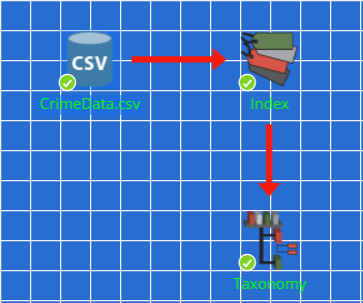
The contrast between the customized style provided above and the default style of the flowchart is to show how users can completely alter the view to fit personal preference.
| Any changes introduced to the flowchart settings are user-specific, and will not affect the appearance of the flowchart when viewed by other users on the same server where the project resides. Customized user settings will be also used for any other projects you access. |
Here are some tips on the flowchart customization:
-
Try and keep a good contrast in colors between the node names, background and the grid, otherwise some of the items may become indistinguishable.
-
Never set color of the node names the same as the flowchart background.
-
Use a readable font. For example, setting WingDingsX01 as the base font may not be the best option.
-
Set a line width that lets you see the arrow at one of the ends of the line, so that it is still easy to see the direction of the line.
-
Choose a background color that does not cause the edges of node icons to appear poorly, and avoid colors that do not blend well with the icons.
-
Do not space the grid too far out, or too close. A spacing between 20 and 50 is good, anything else may be too small or too large.
-
The dot style of the grid is more appealing to the eye than the line style for many users.